This website has been many things over the years. A portfolio, a blog, a landing page for a newsletter and lately it’s been next to nothing. It was time for a refresh.
What I wanted this time was a home. Since I’ve been downgrading a lot on my social media appearance in the last couple of years, I wanted to have a central spot where I could present myself, collect my thoughts, show my projects/experiments and list the great resources I find on the web.
#Design
I went for a simple look. I started by defining the navigation and really wanted to avoid using the hamburger menu on a narrow screen. If it’s possible, it’s just so more convenient to let go of that extra tap to reach the navigation items. I also wanted to take advantage of a bigger screen estate if available so the wrappers reach out at 1640px in some places.
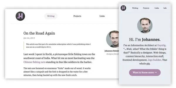
I’ve had some kind of love for this purple/pink color I’ve used in recent years and I relate it to the way I am presenting myself. I use it in my keynotes and everywhere I could attach a color to myself. So I just kept riding that wave. The typeface being used is FF Meta Serif Pro. One of my favorites.
#CMS
WordPress has always been my standard of choice for my personal websites earlier but this time I wanted to go for something more lean and lightweight. My choice fell on Octopress and I am really happy with how it works. Having all my posts and pages as collected markdown documents makes writing and maintenance a joy. Everything in one place. The website also feels so much faster when there is no dependency on a database and deploying new stuff is a blast.
#Conclusion
So here it is. My new home for the rest of 2014. There are still many things to come and some things I want to change but I am happy now that I have a great flexible foundation to further build upon.